Difference between revisions of "Screenshots"
Perspectoff (Talk | contribs) (→File Browser=) |
(Undo revision 25038 by Julie B. Hobbs (Talk) SPAM) |
||
| (34 intermediate revisions by 9 users not shown) | |||
| Line 1: | Line 1: | ||
| + | [[Category: Documentation]] | ||
| + | |||
{| align="right" | {| align="right" | ||
| __TOC__ | | __TOC__ | ||
|} | |} | ||
| − | |||
| − | + | =Videos= | |
| − | + | Watch the new walk-through [[video]] that shows all the major features in LinuxMCE (including setup). A full list of the equipment used and a detailed installation description is included. | |
| − | + | ||
| − | =====Main menu===== | + | =User Interface= |
| − | + | The LinuxMCE on-screen Orbiter User Interface (UI) was designed to be viewed on a basic television from 10' away. There are currently three versions of the UI, and selection depends on the type of video card you have. UI1 is the most basic, and runs on all video cards. UI2 with masking will run on a majority of graphics card (with OpenGL and XDamage support), but UI2 alpha-blended is confirmed to work only with certain nVidia graphics cards. See [[Selecting the Right UI|Selecting the Right UI]]. | |
| + | |||
| + | UI1 takes over the screen whenever you bring up the menu; any video that is playing is reduced to a window. In UI2 your media is always full-screen and is never reduced. (When you're not watching your own video or photos, LinuxMCE displays gallery art from Flickr or a selection of your own photos). | ||
| + | |||
| + | |||
| + | =====''Main menu''===== | ||
| + | The main menu lists the top level options for the room in several categories: Lighting, Media, Climate, Media, Telecom, and Security. In UI1, the first (blank) button in the Media Category is the "Now Playing" button, which brings up the menus for your active media. In UI2, the "Now Playing" button is in the lower left of the screen. Options for your current media (like Audio Tracks, Subtitles, etc.) appear as pop-up sub-menus. All options can be accessed in UI2 from a single screen. UI2 allows you to use your remote control, your keyboard arrows, or your mouse to select the pop-up menu and sub-menus. | ||
| + | |||
| + | =Videos= | ||
| + | Watch a walk-through [[video]] that shows all the major features in LinuxMCE (including setup). A full list of the equipment used and a detailed installation description is included. | ||
| + | |||
| + | =Screenshots= | ||
<table> | <table> | ||
| Line 25: | Line 36: | ||
</table> | </table> | ||
| − | =====File Browser===== | + | =====''File Browser''===== |
<table> | <table> | ||
| Line 40: | Line 51: | ||
</table> | </table> | ||
| − | ===== | + | =====''DVD Remote''===== |
<table> | <table> | ||
| Line 54: | Line 65: | ||
</table> | </table> | ||
| − | + | =====''Dial Direct''===== | |
| − | =====Dial | + | |
<table> | <table> | ||
| Line 69: | Line 79: | ||
</table> | </table> | ||
| − | + | =====''Security panel''===== | |
| − | =====Security panel | + | |
<table> | <table> | ||
Latest revision as of 07:06, 15 September 2010
Videos
Watch the new walk-through video that shows all the major features in LinuxMCE (including setup). A full list of the equipment used and a detailed installation description is included.
User Interface
The LinuxMCE on-screen Orbiter User Interface (UI) was designed to be viewed on a basic television from 10' away. There are currently three versions of the UI, and selection depends on the type of video card you have. UI1 is the most basic, and runs on all video cards. UI2 with masking will run on a majority of graphics card (with OpenGL and XDamage support), but UI2 alpha-blended is confirmed to work only with certain nVidia graphics cards. See Selecting the Right UI.
UI1 takes over the screen whenever you bring up the menu; any video that is playing is reduced to a window. In UI2 your media is always full-screen and is never reduced. (When you're not watching your own video or photos, LinuxMCE displays gallery art from Flickr or a selection of your own photos).
The main menu lists the top level options for the room in several categories: Lighting, Media, Climate, Media, Telecom, and Security. In UI1, the first (blank) button in the Media Category is the "Now Playing" button, which brings up the menus for your active media. In UI2, the "Now Playing" button is in the lower left of the screen. Options for your current media (like Audio Tracks, Subtitles, etc.) appear as pop-up sub-menus. All options can be accessed in UI2 from a single screen. UI2 allows you to use your remote control, your keyboard arrows, or your mouse to select the pop-up menu and sub-menus.
Videos
Watch a walk-through video that shows all the major features in LinuxMCE (including setup). A full list of the equipment used and a detailed installation description is included.
Screenshots
| UI2 with alpha blending / transparency | UI2 with medium settings (masking) | UI1 or Basic UI |
 |
 |
 |
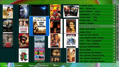
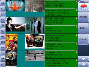
File Browser
| UI2 with alpha blending / transparency | UI2 with medium settings | UI1 or Basic UI |
 |
 |
 |
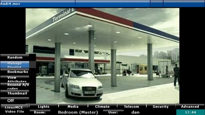
DVD Remote
| UI2 with alpha blending / transparency | UI2 with medium settings | UI1 or Basic UI |
 |
 |
 |
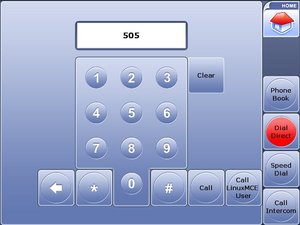
Dial Direct
| UI2 with alpha blending / transparency | UI2 with medium settings | UI1 or Basic UI |
 |
 |
 |
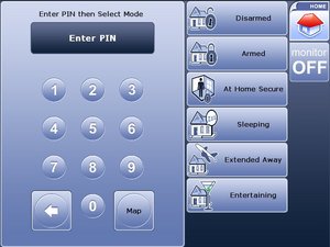
Security panel
| UI2 with alpha blending / transparency | UI2 with medium settings | UI1 or Basic UI |
 |
 |
 |