Screenshots
Videos
Note: The demo video isn't very professional and raised some justified complaints. It is being redone now as we speak with a professional voice over from a volunteer. The new video will be more compact and show more stuff, like what happens when you connect an IP camera, squeeze box, mobile phone, NAS, etc. It will represent an unbiased comparison against the latest Windows Vista Ultimate since we'll just let the cameras roll and show what happens with both system side-by-side and let the viewer be the judge.
Until I get my new Vista Ultimate system installed and re-shoot the video, here's a link to the existing video:The setup video is also coming very soon.
---
Screenshots: Using Linux MCE
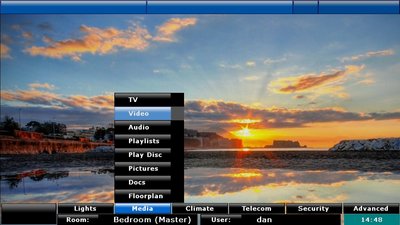
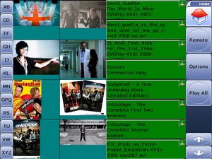
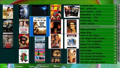
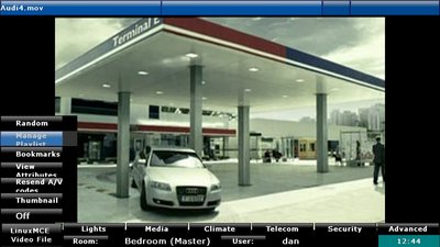
There are 3 UI options. UI1 is the most basic, and runs on all video cards. However, the UI takes over the screen whenever you bring up the menu and any video that is playing gets reduced to a window. This is the easiest UI, because the UI never covers up any of the video. UI2 is preferred because it is completely media-centric. Your media is always full-screen and never reduced. Even when you're not watching your own video or photos, LinuxMCE displays as gallery art the interesting photos of the day from flickr.com with smooth and subtle motion so you always have media full-screen and can leave your TV on as wall art. UI2 is available with masking (medium), which only requires a video card with decent OpenGL and XDamage support. The alpha blending version looks nicer, but it requires a video card that supports the composite extensions, which currently is only the nVidia 6xxx and greater.
Main menu This lists all the top level options in a given room, broken down into categories: Lighting, Climate, etc. In UI1, the blank button between the media icon and the 'TV' is your "Now Playing", which takes you to the control screen for your active media. In UI2, the lower left button is your "Now Playing", and any options for your current media, like Audio Tracks, Subtitles, etc., show up as a sub-menu so you can do everything with only 1 screen. For UI2, use your remote control, or keyboard arrows, or mouse to select the menu pads at the bottom. The sub menu shoots up, like an upside-down version of pull-down menus in a computer application.
| UI1 or Basic UI< | UI2 with medium settings (masking> | UI2 with alpha blending / transparency |
 |
 |
 |
File Browser
| UI1 or Basic UI | UI2 with medium settings | UI2 with alpha blending / transparency |
 |
 |
 |
DVD Remote
| UI1 or Basic UI | UI2 with medium settings | UI2 with alpha blending / transparency |
 |
 |
 |
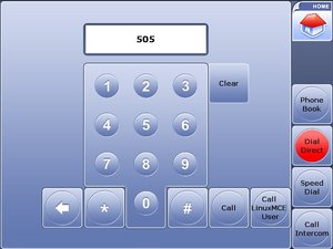
Dial number
| UI1 or Basic UI | UI2 with medium settings | UI2 with alpha blending / transparency |
 |
 |
 |
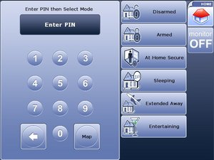
Security panel
| UI1 or Basic UI | UI2 with medium settings | UI2 with alpha blending / transparency |
 |
 |
 |