Floorplan texts
Floorplan Texts
Currently, there is a bug in the display of floorplan texts for mapIcons (the small icons you can drag and drop on your floorplan to control devices)
Here is some documentation on the bug:
- The text location set up in HADesigner is not respected when the text is rendered. Text is always rendered at the Upper Left-Hand Corner (ULX) of the parent icon.
- The text bounding box set up in HADesigner is not respected either when test is rendered. Text always starts at the ULX of the parent icon, and wraps with the Icon's image width.
Floorplans icon texts can be unreadable currently, because the text is black - and sometimes the icon is black - making the text unreadable. This bug prevents us from moving the text either to the side, or above or below the icon where it would be readable (and have a cleaner layout). This bug was found because I was trying to move the icon texts BELOW the icons for a cleaner, more readable floorplan display.
In my examples, I am using the java-base QuickDesigner - but this is irrelevant, as I have verified the same behavior in HADesigner. I will be showing modifications to the Thermostat floorplan icon to illustrate the bugs.
First, this screenshot shows the actual floorplan thermostat icon. You can see that the actual image includes a blank area to the right for the text to fit (NOTE: Need to find out if a text's bounding box can be OUTSIDE of the icon image)
Here is a screenshot of the stock location of the text's bounding box (highlighted in pink). Text should ONLY be displayed in this bounding box (note that the bounding box is TO THE RIGHT of the thermostat icon. This is where the text should appear!)
Here is a screenshot of the page in Designer used to set the size of the bounding box. You can see that originally, it has an offset of 100 (to the right) and a width of 254.
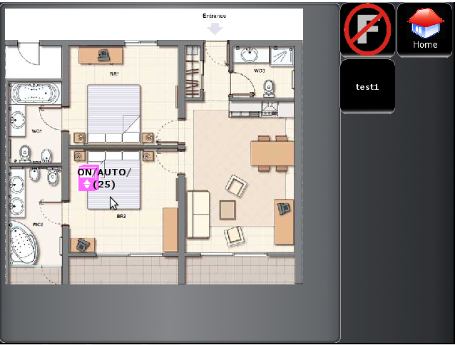
Here is a screenshot of how it appears on the orbiter. Notice that the text is not limited to the bounding box, and starts at the ULX of the icon. Both the location and the bounding box that was set up in Designer is being ignored!
First Modification - Making the bounding box wider I used Designer to make the bounding box of the text about twice as wide (so that the text would not wrap, and to see if text can extend beyond the dimensions of the parent image).
As you can see, I modified the width of the bounding box to be 512 - about twice as wide as it originally was!
As would be expected, the preview shows us that we do indeed have a much wider bounding box:
Now, you would expect that with such a wide bounding box there would be plenty of room for the text, and it would not have to wrap to a second line. But as you can see, how it appears in the orbiter:
Conclusions from this first round of modifications:
- The bounding box's offset from the parent icon is not preserved and indeed text rendering is always at the ULX of the parent icon.
- I still can't tell if it should be possible to have a text's bounding box outside of the parent image. If the text didn't wrap like expected, it would have proved that text could exist outside of the parent icon's dimensions.
Another modification - making the bounding box much narrower
In this test, i used designer to make the bounding box much narrower that it was originally. The reason for this test is to see if the bounding box is considered at all for wrapping, or if text wrapping is based on consideration of the parent icon's width.
For this test, I made the bounding box width=125 (about half of the original value)
You can see from the preview below, that the new bounding box area is much narrower.
I would have expected the text to wrap to at least 3 lines because the bounding box is so narrow. However, as you can see from the image below, the result has not changed at all, and the text still starts at the ULX of the parent icon, and wraps to the parent icon's with.
Conclusions from this round of modifications:
- It is now apparent that the bounding box set up in Designer is not respected at all, and instead, the text is always started at the parent icon's ULX, and wraps to the width of the image
- I would imagine, that if we were to fix this bug, then text should be able to exist OUTSIDE of the parent icon's dimensions. To do this, the starting position of the text should be equal to the parent icon's ULX + the X and Y of the text (these are offsets). Also, for wrapping purposes, the texts width and height properties shoudl be added to the texts starting position. It would appear that this was never even implemented in the orbiter code.


